A website's background is the paint on the wall. You only notice it when it's wrong. When it works, you barely register it: your brain perceives "this site is on-brand" without knowing why.
These are the nine sites I keep coming back to when I need a background that isn't a flat color (boring) or a stock photo (cliché).
Ready-to-download images and textures
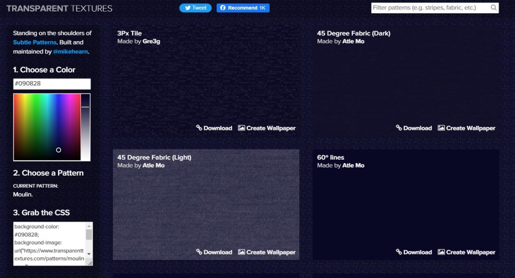
1. Transparent Textures
transparenttextures.com — over 100 textures with transparency you apply as an overlay on any base color. My favorite: Subtle Stripes at 5% over dark blue.
2. Subtle Patterns
toptal.com/subtlepatterns — the classic. Repeatable square patterns, all in greyscale or very low tones. They curate well.
3. Dinpattern
More artistic, almost painterly textures. Useful for landing pages of products with strong personality.
4. COLOURlovers Patterns
colourlovers.com — veteran community with thousands of user-submitted patterns. Useful if you're after something very specific (Art Deco, Japanese, geometric…).
5. Wallpapers.com
Including it even though it's more desktop-wallpaper-oriented, because its patterns section works for hero sections.
CSS-generated patterns (nothing to download)
6. CSS3 Patterns Gallery
Lea Verou put together a public gallery of pure-CSS patterns years ago. Copy-paste and done.
7. Patternizer
patternizer.com — my favorite generator. Adjust lines, angles, colors, transparency and opacity. Outputs clean CSS, copy-paste at the end. What I use for form and modal backgrounds.
8. MagicPattern
Commercial generator with a huge library. Free tier is very decent; the paid one is worth it if you build lots of landings.
9. Hero Patterns
heropatterns.com — over 90 repeatable SVG patterns with a live color slider. Outputs SVG packed as a data-URL ready to paste into CSS.
How to apply a background well
- Low opacity. 5–10% is usually enough.
- Dark base color + light texture works better than the reverse (less eye strain).
- Small tile. If the pattern repeats every 800 px, on small screens it looks flat. Aim for 100–200 px.
- Test on mobile. Patterns that look elegant on desktop sometimes feel like noise on phones.
This store uses a very subtle orange+blue radial gradient as a halo in the blog hero. Zero pattern, just color, and it works. Sometimes the best move is using none.